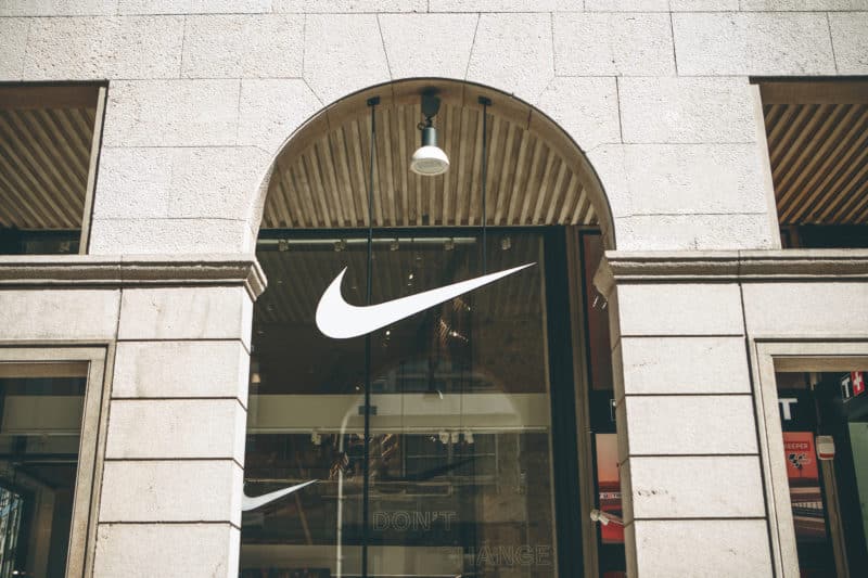
Have you ever stopped and noticed just how incredibly simple the Nike Swoosh is? On face value, it’s just a checkmark. Sure, it’s slightly stylized and has some movement to it—but it doesn’t have any overly unique frills nor any easily discernible features that say “athletic apparel”.

This simple little mark was designed in 1971 for a mere $35 by Carolyn Davidson, a design student at Portland State University. Today, that same icon remains largely unchanged since its inception and it is considered to be one of the most easily recognizable logos on the planet—valued at over $26 billion for the logo alone.
Through years of consistent use, the Nike Swoosh has become synonymous with sneakers, sports, athletics, and even the very concept of motivation itself: Just do it. It’s so easy to identify and recreate, that most people around the globe could probably draw a rough sketch of it by memory and other people would still recognize it as Nike.
The Nike Swoosh is a masterclass in why simplicity matters in a logo. There are many reasons why the world’s most successful brands typically have the most simple logos that rarely change over time.
Nike, McDonald’s, Target, Apple, and Chase Bank might have multi-million dollar marketing budgets, but any size business or organization can learn from their simplistic brand identities.

A Logo is Meant to Identify, Not Explain
As I mentioned before, the Nike Swoosh doesn’t tell the viewer anything about sports, athletics, or apparel. It’s just a unique checkmark that can be identified in milliseconds, in part, because of its simplicity.
A common pitfall that some companies fall into is wanting their logos to literally explain what their business does. If you’re a dentist, your logo should have a picture of teeth, right? Maybe not. Adding images, words, and taglines that literally represent your current service or product can either overcomplicate your logo, or make it so generic that it doesn’t have any unique appeal or memorability.
This pitfall of “literal logos” will also pigeonhole your identity to only represent whatever your company is offering today. Imagine if the Nike logo was an icon of a shoe or if the Apple logo was an icon of a computer. They would have to update their logo every time they decided to offer a new product or service.
The key to a great logo is making it appropriate for your overall brand strategy, making it unique enough to stand out from other brands, and making it simple enough to be recognized at a glance. All of your other branding and marketing goals should be addressed in other ways. Let your logo identify your brand, and let everything else you do explain it.
Simple Logos Last Longer (and Reach Further)
A simple identity mark allows your brand to better stand the test of time. As trends and tastes change with the wind, simplicity is a constant. The more decorations, fonts, icons, colors, effects, and text you add to your logo, the greater the risk is that your logo will fall out of fashion as the seasons change.
A minimalist approach to your company logo may feel restrictive now, but it actually allows for more adaptability and fluidity in the future. One of my favorite examples of this concept in action is this Apple commercial from 2014.
This ad is technically for the MacBook Air, but it’s mainly a flex for how versatile and confident Apple’s brand identity/logo is—it can complement any style and never lose its meaning, identity, or value.
Speaking of versatility, your logo needs to work in varying scales, color formats, and mediums to truly succeed at identifying your brand across the board. Nike’s logo can be displayed in virtually any size, color, or material, and it will still be legible and recognizable. This is a big reason why the Nike Swoosh is so incredibly valuable—because it can be easily replicated and distributed on any type of product or service that Nike can conceive.
Simplicity is Complicated
“I didn’t have time to write a short letter, so I wrote a long one instead.” -Mark Twain
The paradox of simplicity is that it can actually be quite difficult to achieve. It takes time, experience, skill, and inspiration to consistently create and fine-tune simple ideas. This is especially true of logo design in the modern world. Sure, there are thousands of tools, apps, agencies, freelancers, and services out there that can crank out a logo for you in just a few days at a low cost…but buyer beware, because cheap logo design is risky business.
If a logo is fast and easy to create, chances are, someone else has already done it. At best, you’re putting your brand at risk of being generic, or at worst, at risk of being sued for copyright infringement. The value of a genuinely distinctive logo is immeasurable because the ceiling for your potential brand equity is so high (more on that in the next section).
Now, this isn’t to say that truly unique, inspired, and simple ideas can’t come out of the blue, to anyone—of course they can. The Nike Swoosh was designed in just 17 hours by a college student! But, with something as invaluable as your brand identity, the goal should be to minimize risk and maximize safety. This is where tried and tested research methodologies and creative expertise become extremely helpful in ensuring your brand identity is strong, successful, and less risky.
Ultimately, Logos are Symbols of Brand Equity
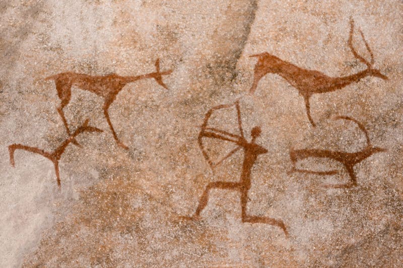
Humans love symbols. Since primitive times, we have been drawing simple little pictures to represent things we see in the world.

Throughout time, these symbols and icons have evolved to represent very abstract concepts like religions, political groups, communities, countries, services, sports teams, and of course, brands. Today, we live in a world of symbols and icons. Every app, website, store, tv show, and email signature contains symbols that we interact with on a daily basis. Through repetition and time, these little symbols gain meaning, value, and power.

For a brand, your logo is ultimately a symbol of your brand equity—which is potentially the most valuable asset a business can own. Brand equity is all the countless associations that people have with your services, products, and offerings, created over time—and the sky is its limit.
Your logo serves as a vessel for brand equity to be filled up by your audience. So, the more simple a logo is, the easier it is for people to give it meaning and value as they interact with your products and services.
The Nike Swoosh has gained 50 years of history and $26 billion worth of brand equity—all in a single little checkmark.
Be like Nike and keep your logo simple.

