As communicators, a great deal of our work is driven by words. However, words are not the only way to tell a story, inform an audience, and communicate with our peers. Visual communication is by no means a recent discovery – it has existed arguably ever since humanity began. What started with art, dance, and even cave paintings has now evolved to encompass more modern platforms like photography, videography, television, the Internet, social media, and augmented reality.
With an audience that is more well-versed than ever in consuming content visually, now is the time to expand your communication plan to incorporate visuals, if you’re not already doing so. Whether it’s motion graphics, videos, photographs, infographics, data visualizations, or anything in between, utilizing a form of visual communication will elevate your work, expand your reach, and give you an edge over your competitors. Here are six tips to help get you started:
Tip No. 1: Quality over Quantity
 While the purpose of visuals is to make information easier to understand, a cluttered and rushed visual can do just the opposite. It’s safe to say that most of us have come across a graph or data visualization that just left us confused and overwhelmed. To avoid giving your audience a similar experience, invest time in each visual to ensure that it is clear, intuitive, and true to your brand. As shown in this infographic, it takes under 50 milliseconds to form a first impression, so putting in that extra time and effort will go a long way with your audience.
Tip No. 2: Consistency Is Key
 According to Sheridan Prince of Killer Visual Strategies, consumers and employees are more likely to retain information when the material provides a sense of familiarity and consistency. So, when it comes to the tone and style of your visuals, always keep it synonymous with your brand identity.
Erin McCoy gives us two tools to achieve this, while simultaneously saving time and money:
- A visual language – Before you embark on incorporating visuals into your communication plan, create an accessible folder or document that clearly defines each element of your organization’s visual style. Give guidelines and examples of acceptable color schemes, fonts, textures, tones, layouts, symbols, etc. Have everyone on your team refer to these guidelines when creating new visuals and as a result, your organization will maintain a consistent aesthetic that reinforces your brand identity.
- A visual workbench – This digital “workbench” folder should contain the basic tools that you can use time and time again: completed logos, icons, graphs, images, designs, and infographics. Your workbench is reserved for the visual assets that best describe the core of your organization, its mission, values, and clients, so be selective here.
Tip No. 3: When it Comes to Text, Less Is More
 This is the bottom line of visual communication and essentially the whole point! Studies show that we process visuals 60,000 times faster than words and remember 80% of what we see and do, as opposed to only 20% of what we read. Your visuals should already say it all, and with higher efficiency and retention, so why clutter them with clunky text? Of course titles, labels, dates, numbers, and captions can be essential to understanding a visual, so use your best judgment to determine what text is helpful and what can be eliminated.
Tip No. 4: Optimize Your Visuals for Each Platform
 The world of visual content is massive and constantly growing. With so many social media platforms, programs, and devices, your visuals will need to be optimized for each outlet. Logistically, you may need to adjust the dimensions, size, duration, and style of your visuals in order for them to be accessible and effective on any particular platform.
As you are optimizing, also keep in mind the benefits of each platform and take advantage of them. For example, Instagram stories allow for more interaction from viewers, so try using polls, questions, quizzes, sliders, chats, and links (check out this Instagram guide to learn more about how to use these features). On the other hand, presentations have the potential for more motion graphics, while a brochure could benefit from infographics and supportive text.
Tip No. 5: Utilize Visual Communication Internally
 Why should the power of visuals only apply to your external audience? Try utilizing visuals to strengthen your organization’s internal communication as well. With the help of visual communication, you can defy all odds by making memos interesting, training programs engaging, and reports memorable. The Social Science Research Network states that 65% of people are visual learners, so taking the time to create informative visuals for your team will not go unnoticed. As a result, employees will retain more information, stay on the same page, and gain a sense of collaboration.
Tip No. 6: Be Resourceful
 Not all of us were born with an eye for design, and that’s okay! Don’t be afraid to take advantage of the plethora of resources available online – many of which are free! If you’re interested in creating visuals, but intimidated by the thought of starting from scratch, play around with templates and guides to build confidence and get excited about the endless possibilities of visual communication. There are plenty of sites to try, but here are a few favorites:
- Canva – This site is a must for creating anything and everything visual; from animated social media posts and presentations to infographics and mind maps, they’ve got you covered. With plenty of stylish templates to choose from and an intuitive layout, it welcomes users with any level of design experience.
- Piktochart – If you’re looking to create simple and sleek infographics, presentations, or printed materials, this is the site for you. It provides step-by-step tutorials and the option to collaborate on any project by sharing access with teammates.
- Visme – For a more interactive approach, try using Visme to create infographics and presentations with links, pop-ups, and animations.
- Infogram – This site is great for creating infographics and visually interesting reports. It’s free, but optional paid plans feature analytics and metrics to help you measure your success.
- Snappa – For those of us who have a lot on our plate and not a lot of time, this is your quickest option for creating simple infographics.
- Adobe – For the more technologically savvy population, Adobe InDesign and Illustrator are tried and true programs for creating custom visuals for almost any platform. For videos, Premiere Pro is an industry go-to.
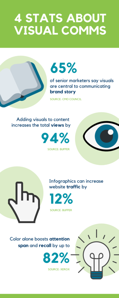
If you’re still wondering why visual communication is relevant to you and your organization, I’ll leave you with a few numbers that speak for themselves (in an infographic that I’ve created, of course, because if I can do it, you can do it).